5 Tips for Better Mobile Quality Scores
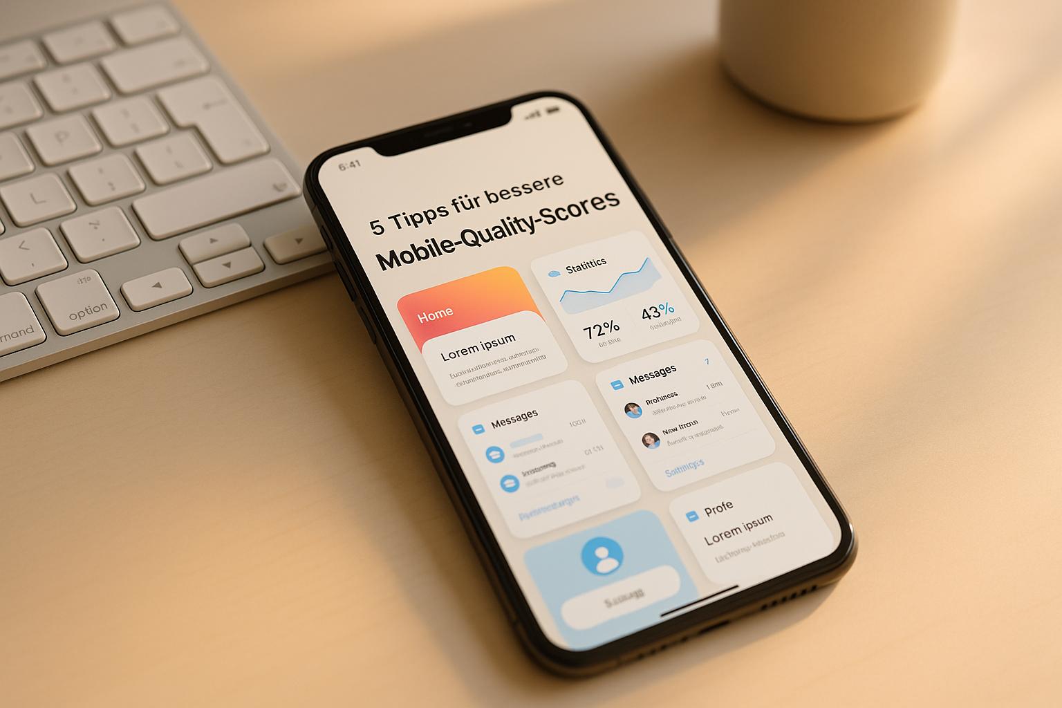
In short: A high Mobile Quality Score saves cost, improves ad placement, and boosts conversions. Here are the five core measures:
Table of contents 11 sections
- 01Google Ads Mobile Page Speed Score
- 021. Accelerate mobile page load times
- 032. Align ad copy with landing pages
- 043. Improve mobile user experience
- 054. Write better titles and meta descriptions for mobile search
- 065. Use high-quality, mobile-friendly media assets
- 07Conclusion
- 08FAQs
- 09Why the load time of your mobile website is decisive
- 10What is responsive design?
- 11Related posts
- Optimize load times: Pages should load in under 3 seconds. Compress images, minimize JavaScript, and use CDNs.
- Align ad copy and landing pages: Keywords and content must match perfectly to meet user expectations.
- Improve mobile user experience: Responsive design, simplified navigation, and optimized forms drive better usability.
- Adapt titles and meta descriptions: Short, concise copy with relevant keywords increases click-through rate.
- Mobile-friendly media assets: Images in WebP/AVIF format and lazy loading reduce load times and improve performance.** Bottom line:** Anyone who lowers load times, aligns content, and prioritizes the mobile user experience achieves better Quality Scores and saves up to 50% of click cost.
Google Ads Mobile Page Speed Score
1. Accelerate mobile page load times
The speed at which mobile pages load plays a key role in the Mobile Quality Score. As early as 2018, Google officially confirmed that mobile page load time is a ranking factor. Faster load times not only deliver a better user experience, they directly increase the Mobile Quality Score.** 53% of users leave a website if it takes longer than 3 seconds to load. A delay of just one second can lower the mobile conversion rate by up to 20%.** Google recommends a load time of about three seconds, while top pages often load in just 1.65 seconds.
Practical optimization tips
Here are a few effective measures to improve load times:
- Compress images: Tools like TinyPNG reduce file size without visibly harming image quality. Modern formats like** WebP and AVIF** offer more efficient compression than older formats like JPEG or PNG. Lazy loading also helps, since images only load once they are visible.
"By compressing images, you can speed up your website's loading time, which is important for user experience, conversions, and visitor retention." - Sharp Innovations, Inc.
- Optimize JavaScript and CSS: Minifying JavaScript and CSS files removes unnecessary characters, comments, and whitespace, which significantly reduces file size. Non-critical JavaScript should be deferred so that main content is shown faster.
- Enable file compression: Compression techniques can reduce file sizes by 50 to 70%, in some cases even up to 90%. Browser caching and the use of Content Delivery Networks (CDNs) further shorten load times.
Google PageSpeed Insights as a tool
The free tool Google PageSpeed Insights provides detailed analysis and optimization suggestions for mobile and desktop versions of your website. It measures key metrics like First Contentful Paint (FCP), Largest Contentful Paint (LCP), and Cumulative Layout Shift (CLS).
"PageSpeed Insights (PSI) reports on the user experience of a page on both mobile and desktop devices, and provides suggestions on how that page may be improved." - Google Developers
The tool not only surfaces weak spots but also shows how to fix them. Even a 0.1-second improvement in load time can positively influence the entire customer journey.
2. Align ad copy with landing pages
Alignment between ad copy and landing pages is a central lever when it comes to better Mobile Quality Scores. When users click an ad and land on a page that doesn't match their expectations, they often leave again quickly. That hurts not just user experience but also your Quality Score.
A clear connection between ad copy and landing page builds trust and reinforces your brand's reliability. Relevant content produces a higher Quality Score, which in turn enables better ad positions and lower cost per click. Google looks at how well the landing page matches the search query and the ad — the better the alignment, the higher the Mobile Quality Score. A key to that is targeted keyword optimization.
Optimize keyword alignment
A proven approach: Use the central keyword from your ad in the H1 heading of the landing page. The landing page content should be aligned as precisely as possible with the search queries. If your ad, for example, emphasizes the term "affordable phone cases", that term should appear prominently and visibly on the landing page.
The message, tone, and offers from the ad should be seamlessly echoed on the landing page. This reinforces the promise made in the ad and leads to a better user experience — which ultimately also shows up in higher conversion rates. The landing page copy should pick up central key phrases from the ad and present the benefits clearly and understandably.
Practical implementation of the alignment
Integrate relevant PPC keywords into the content of your landing page to meet user intent in the best possible way. Thorough keyword research and the creation of specific ad groups help you develop targeted ad copy that is aligned with the most important keywords.
Visual consistency between ad and landing page also plays an important role. It strengthens brand identity and ensures a unified user experience. Both the ad and the landing page should be optimized for mobile devices, because the message that triggers the click should be the same one that ultimately leads to conversion.
Create ad copy that conveys a clear and compelling value proposition — and make sure that this promise is directly and clearly visible on the corresponding landing page. A well-aligned PPC landing page creates a smooth transition and significantly increases the likelihood of conversion.
3. Improve mobile user experience
A strong mobile user experience is decisive when it comes to higher Quality Scores. Since mobile usability is a core assessment factor, poor mobile usability can significantly degrade scores. A thoughtful responsive design is the key to optimal mobile use.
Responsive design: a must
Responsive design is no longer optional but a given. Frank Spillers, CEO of Experience Dynamics, puts it plainly:
"Responsive is a default. Responsive is not an option – . And the reason is because that's where the world is at. Everyone expects things to be mobile-optimized, and responsive just means that if I switch from my laptop to my tablet to my phone, the site's going to fit to that resolution; it's going to kind of follow me."
For responsive design to work, flexible grids, adaptable images, and media queries are essential. These elements ensure that your website looks good and works smoothly on all screen sizes.
Mobile-first approach: the right way
The mobile-first approach has proven especially effective. Companies like Dropbox have used this strategy to create a consistent user experience and significantly increase mobile engagement. Another example is Flipkart: With fast load times and simplified navigation, the company was able to generate the majority of its sales through mobile devices.
With mobile-first design, layout starts with the smallest screens and is progressively extended for larger displays. This way the focus is on the most important content, while more complex elements are reserved for the desktop version. This approach improves not only the mobile user experience but also the Mobile Quality Score.
Simplify navigation and controls
Intuitive navigation is especially important on mobile devices. Menus should be clear and easily accessible, and page structure should remain** consistent**. Features like breadcrumbs and a search bar can further ease navigation.
Controls must also be adapted to touch devices. Clickable areas should be at least 30 pixels in size, and** Scalable Vector Graphics (SVGs)** are excellent for icons since they render sharply on all screen sizes.
Optimize forms for mobile
Forms are often decisive for conversions and therefore deserve special attention. Research by the CXL Institute shows that users fill out single-column forms 15.4 seconds faster than multi-column variants.
Reduce forms to the essentials, and place clear labels above input fields. Use the matching input keyboard for each field, such as the numeric keyboard for phone numbers. Avoid dropdown menus and instead use radio buttons or autocomplete.
Regular testing and adjustment
To surface possible issues, you should test your website regularly on different devices. Ensure that content is easy to scan through headings, lists, and short paragraphs. Integrate at least** three breakpoints** in your design and go for a clear and uncluttered style.
Ongoing improvement of the mobile user experience can not only raise the Quality Score but also lower click cost and increase conversions.
4. Write better titles and meta descriptions for mobile search
Once the mobile user experience has been optimized, it's just as important to craft titles and meta descriptions specifically for mobile search queries. These elements influence not only visibility but also the quality of your search results.
Keep character limits in mind
For desktop meta descriptions, Google recommends about 920 pixels (approx. 158 characters), while for mobile devices 680 pixels (around 120 characters) are ideal. Titles should be between 50 and 60 characters to avoid truncation.
A study of 10,000 title tags shows that average length falls between 42 and 46 characters. Gary Illyes of Google explains:
"Title length is an externally invented metric... Technically there is a limit, but it's not a small number. It's not 160 characters or whatever — 100, 200, 20, or whatever."
Craft titles for mobile users
Mobile search queries are often direct and demand quick answers. To address users, the most important keywords should appear at the beginning of the title. Long-tail keywords help to cover more specific queries. Since mobile screens are smaller, long titles often get truncated, which can lead to incomplete information.
Short and concise titles are not only easier to read but also improve load time and user experience.
Create effective meta descriptions
Google rewrites between 60% and 70% of meta descriptions. That's why it's decisive to write clear and concise descriptions from the outset. For mobile devices, these should not exceed the** 120-character limit**.
"A meta description tag typically informs and interests users with a short, relevant summary of what a particular page is about. They're like a pitch that convinces the user that the page is exactly what they're looking for."
Use active language, include a clear call-to-action, and address your audience directly. Keywords should be integrated naturally without overloading the description.
Account for local searches
For local businesses, location-specific keywords are especially valuable. Terms like "near me" or mentioning local landmarks help to raise relevance for local queries. This optimization increases the likelihood that your business is found in local searches.
Voice search and natural phrasing
Since many mobile users rely on voice search, meta tags should be phrased in a natural, conversational tone. This not only creates a better user experience but can also positively influence the Quality Score.
Continuous adjustment and optimization
Regularly test different versions of your meta tags to find out what works best for your audience. Monitor how Google presents your titles and descriptions, and adjust them when needed. Clarity and relevance should always be the focus, rather than rigidly targeting character limits.
Gary Illyes offers the following guidance:
"Try to match it precisely to the page, but I wouldn't think too much about how long it is or whether it's long enough or way too long. If it fills your screen, then it's probably too long, but if it's just one sentence that fits on one or two lines, you won't get a manual action for that."
5. Use high-quality, mobile-friendly media assets
Well-optimized media assets not only improve the user experience but also have a direct impact on the Mobile Quality Score. Images and videos that are not adapted for mobile devices can extend load times and lead to users bouncing. Here are a few approaches to prepare images, videos, and other media assets optimally for mobile.
Why load speed matters for media
Load times play a huge role: 40% of visitors leave a page if it takes longer than three seconds to load. Adrienne Clem of Google puts it plainly:
"Great mobile user experience starts with speed. This is your first impression for a prospective customer and signals not just about the quality of the experience of the web page - it's also the quality of your brand and product."
Shopify showed that faster load times on mobile devices can increase the conversion rate by 20%. Even a 0.1-second improvement in load time can positively influence the entire user experience.
Optimize images for mobile
Images should be adapted to widths between 320 and 720 pixels. With the srcset attribute in img tags, you can deliver different image resolutions depending on the device.
Modern image formats like WebP and AVIF offer considerable advantages. WebP files are on average** 26% smaller than PNGs** in lossless mode and offer** 25 to 35% smaller file sizes** at equal quality compared with JPEG. AVIF goes even further: lossy AVIF images are about** 50% smaller than JPEGs** without sacrificing visual quality.
Lazy loading and CDN for better performance
Lazy loading only loads images and videos when they appear in the visible area. This significantly reduces initial load time, which improves perceived page speed.
A Content Delivery Network (CDN) can further optimize load times by delivering content through geographically distributed servers. Videos should also be specifically adapted for mobile devices to optimize load time and user experience.
Optimize videos for mobile users
Videos should stay under two minutes to hold user attention. Modern codecs like** H.264 or H.265** offer efficient compression. With adaptive bitrate streaming, video quality dynamically adapts to available bandwidth.** Controls** should be touch-friendly, with easily accessible buttons. Audio should be clear and tuned for mobile devices, without excessive bass.** Subtitles and captions** not only improve accessibility but also offer SEO benefits.
Choosing the right format
The choice of image format has a big impact on performance:
| Format |** Compression** |** Quality** |** Fit for mobile** | | JPEG | Moderate | Good | Standard for photos | | PNG | Lossless | Very good | Larger files | | WebP | High | Good | 26% smaller than PNG | | AVIF | Very high | Excellent | 50% smaller than JPEG |
Since AVIF is not yet supported by all browsers, you should offer fallback options like JPEG or PNG. Since over 70% of web traffic comes from mobile devices, choosing the right format is decisive.
The decision for a format depends on factors like operating system, device capability, and image complexity. WebP and AVIF are often the best choice, while traditional formats can be used for specific requirements. This way, you can not only increase the performance of your content but also positively influence the Mobile Quality Score.
Conclusion
Improving Mobile Quality Scores is not a one-off project but an ongoing process that significantly influences the success of your Google Ads campaigns. The approaches presented here — from optimizing load times to mobile-friendly media assets — work together to create a smooth user experience that leads to higher conversions. Concrete examples show how such measures can deliver measurable results.
Studies confirm that fast load times and mobile optimization significantly raise both conversion rates and ad performance. Forecasts suggest that global spend on mobile advertising will grow to $402 billion by 2025.
"Mobile optimization is no longer optional - it's essential." – Mark Angelo Tolores, LinkedIn
Websites that achieve load times under two seconds record a provable uplift in conversion rates of 15%. Likewise, thoughtfully designed call-to-action buttons can increase conversions by an impressive 232%.
A practical example shows the impact of optimization: A company used a simple microsite and improved PageSpeed to raise keyword Quality Scores from 1–4/10 to 4–8/10 in just one week. That led to a doubling of click volume and a 15% reduction in CPCs.
Since Google's algorithms and bidding strategies are constantly evolving, regular adjustments are essential. Continuously test new ad copy, refine your keyword strategies, and adjust your bids to the most active times of your audience.
The results show how important expertise in mobile optimization is. Nordsteg OnlineMarketing delivers tailored solutions here: With solid experience in Google Ads management and performance optimization, you can sustainably improve your Mobile Quality Scores. A Nordsteg client achieved a revenue uplift of +112.65% thanks to optimized campaigns.
The investment in mobile optimization pays off: Consumers are 37% more willing to buy on mobile-friendly websites, and 76% of smartphone users visit a business within a day after a search. With the right strategies, you can fully realize this potential and improve your Mobile Quality Scores long term.
FAQs
How can I optimize the load time of my mobile website to improve the Mobile Quality Score?
Why the load time of your mobile website is decisive
The load time of your mobile website plays an important role for the Mobile Quality Score. A fast page not only creates more satisfied users, it also improves your position in search results. Here are a few practical tips for reducing load time:
- Compress images: Use optimized formats and reduce file sizes without harming quality too much.
- Remove unnecessary scripts: Clean your website of superfluous JavaScript and CSS to shorten load time.
- Use caching: Enable caching so returning visitors can retrieve content faster.
- Use better hosting: A high-performance host or the use of a Content Delivery Network (CDN) can massively improve load speed.
The goal? A load time under 3 seconds. That's the sweet spot that satisfies both your users and the Quality Score. Tools help you analyze your website's speed and fix weak spots in a targeted way. Fast load times are not only technically sensible, they also make your visitors happy.
How do keywords influence the Mobile Quality Score through alignment of ad copy and landing pages?
Keywords play a decisive role when you want to raise the Mobile Quality Score. They connect search queries, ad copy, and landing pages so that everything is perfectly aligned. The better this connection works, the more relevant your ad is perceived by potential customers.
Targeted optimization of keywords not only improves the user experience but also shows Google that your ad and landing page deliver exactly what users are searching for. That can raise your Quality Score and significantly improve the performance of your campaigns.
Why is responsive design important for the mobile user experience and how does it affect the Mobile Quality Score?
What is responsive design?
Responsive design ensures that a website automatically adapts to the screen size of the device in use. That means: content remains easy to read, navigation is simpler, and load times improve — especially important for mobile users.
Another advantage: A thoughtful responsive design has a positive effect on Core Web Vitals, such as load speed and visual stability. These factors play a central role in Google's assessment system and directly influence the** Mobile Quality Score**. A mobile-optimized website thus not only creates more satisfied visitors but can also noticeably improve the performance of your Google Ads campaigns.